

Timeline
1.5 years
Role
Lead Product Designer
Platforms
Mobile App & Responsive Web
Tools
Sketch, Invision, Jira
Background
What is FabFitFun?
FabFitFun is a female subscription box focused on lifestyle, beauty, health, wellness, and tech, offered in an annual or seasonal (quarterly) membership.
The membership includes a seasonally themed box of 6-8 full-size products, access to shop multiple flash sales with products at up to 70% off, the opportunity to reFill their favorite products each season at up to 75% off, an always-on Shop to purchase products between the sales, exclusive brand offers , custom magazine and TV content, and an online community forum of over one million other women.
Overview
The Original Orders Feature
The original Orders page was originally separated into two sections: Subscription and Shop Orders. The Subscription section would show past boxes in the membership, but not the products inside. The Shop Orders section would only show purchases made within The Shop.
This page offered no order summary or visual reference to the product purchases, and apart from the boxes, there was no tracking information provided for the orders.


User Pain Points
The Workaround
The lack of information shown prompted members to take things into their own hands. Some resorted to screenshotting their purchases and storing them in a folder on their computer. Others would frequently reach out to our Customer Care team with questions revolving around their most recent order, tracking information, subscription details (renewal cost or remaining boxes), or what seasonal box they would receive.
“I put in an order with the annual members edit sale, it's showing up in my invoices but not my current orders. Is this okay? Is there going to be an issue?”
In the Fall of 2021, “confirming order details” continued to drive CX contacts with about 10K reach outs. In December 2021 alone, order status was one of the top two categories, constituting 19.1% of total reach outs.
The Problem
The Orders page did not display a comprehensive overview of all purchases.
Missing E-Commerce Orders
Flash sales (Add-Ons and Edit), Boost, and reFills orders were not displayed on the Orders page. For those that were shown, their order summary had no visual aid and it was not very clear.
Lacking Tracking Information
Any orders that required multiple shipments, included a dropship item, or were purchased from The Shop or in a Flash Sale, did not display any form of tracking information on the Orders page.
The Solution
Provide members with a single place to view all their orders from any e-commerce program and track each of their shipments.
MVP Requirements
Fulfilling the Users’ Needs
All Previous Orders
Users should be able to navigate to the Orders page and view all previous order information, no matter which program it was purchased in.
Order Details
After completing a purchase, users should be able to view all the details of the order. This includes its status, all of the products included, the total price, and where it was shipped to.
Tracking
Once an order has shipped, a tracking link should be shown for each individual shipment, so users may know exactly when they will receive each product of their purchase.
Dropship Items
Users should be able to identify any dropship items in their orders, so they can know which products will be shipped separately.
Invoices
The invoices of each order should be available and easily accessible to the users.
Subscription Status
Both the renewal date and remaining boxes in the subscription should be present on the Orders page, when applicable, so users may always know the status of their membership with FabFitFun.
Research & Inspiration
Market Research
When determining how to approach the new Orders page, I first looked at some of the leading e-commerce brands in the space: Amazon, Target, DoorDash, Grubhub, Best Buy, Express, and DSW.
I observed the overall design of each brand and how they approach displaying the following information: details shown in order preview, multiple orders, order status, tracking information, and how they name their Order page. Some of my findings were:
Only some brands display product image previews
All orders are collapsed and prompt you to expand
Order status or estimated date of delivery is shown
Most show the number of items, order total, and order date
Most show an order in a white rectangle on a light gray background


ideation
Mid-Fidelity Wireframes
After reviewing the research and requirements, multiple wireframes were explored to determine the best UX to fulfill users’ needs across all devices.
Mobile Wireframes


Desktop Wireframes


iterations
Working to Find the Best Solution
Once determining the best wireframe to proceed with, many rounds of iterations were produced. These iterations also incorporated any updated user requirements or technical limitations.
Mobile Iterations


Desktop Iterations


The First Launch
Invoice History
Throughout the duration of this project, it was determined that the engineering team, unfortunately, did not have the bandwidth to develop the full Orders page within the designated timeline. Therefore, to still deliver something beneficial to the users, the current requirements were scaled back to only display the invoices of the orders on a page called Invoice History.


The Solution
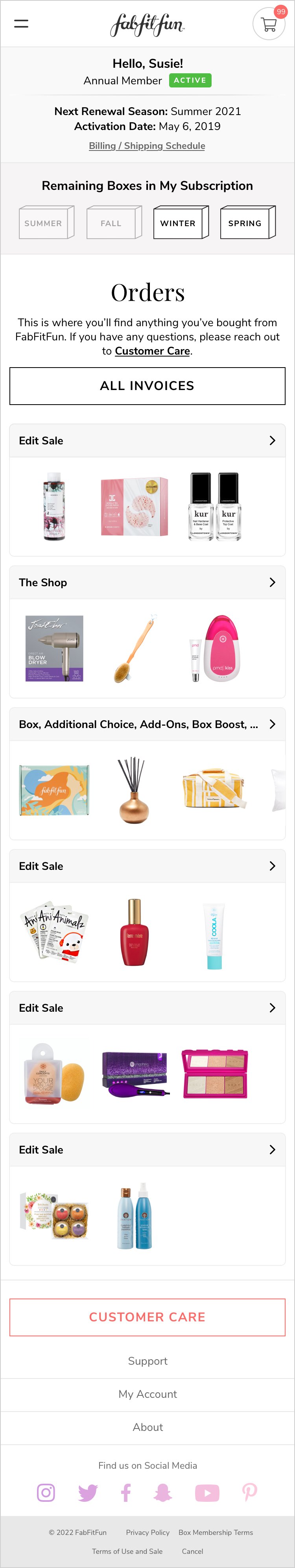
Final High-Fidelity Mocks
It came time to reconsider the Orders page sometime after the successful launch of the Invoice History page. After rounds of iterating, considering technical limitations, checking the fulfillment of user requirements, and determining the best user experience, the final designs for the new Orders page were solidified for both the mobile app and web.
Mobile Mocks


Desktop Mocks


Tablet Mocks


feature Launch
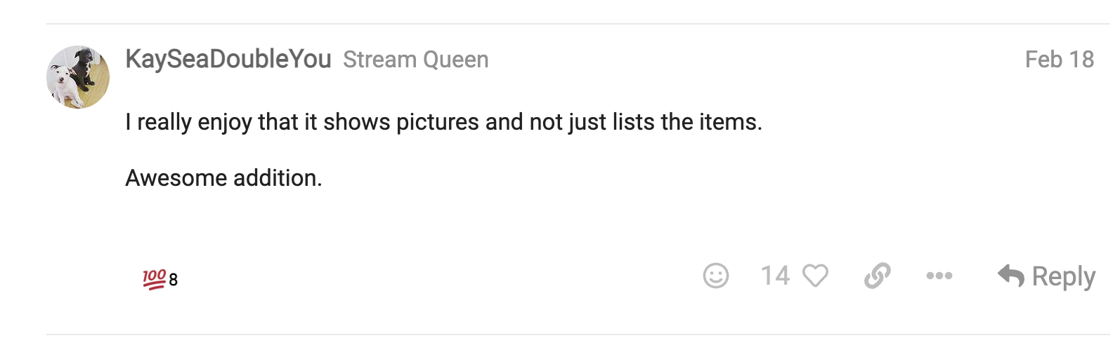
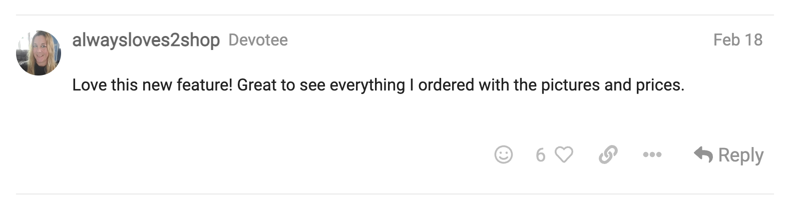
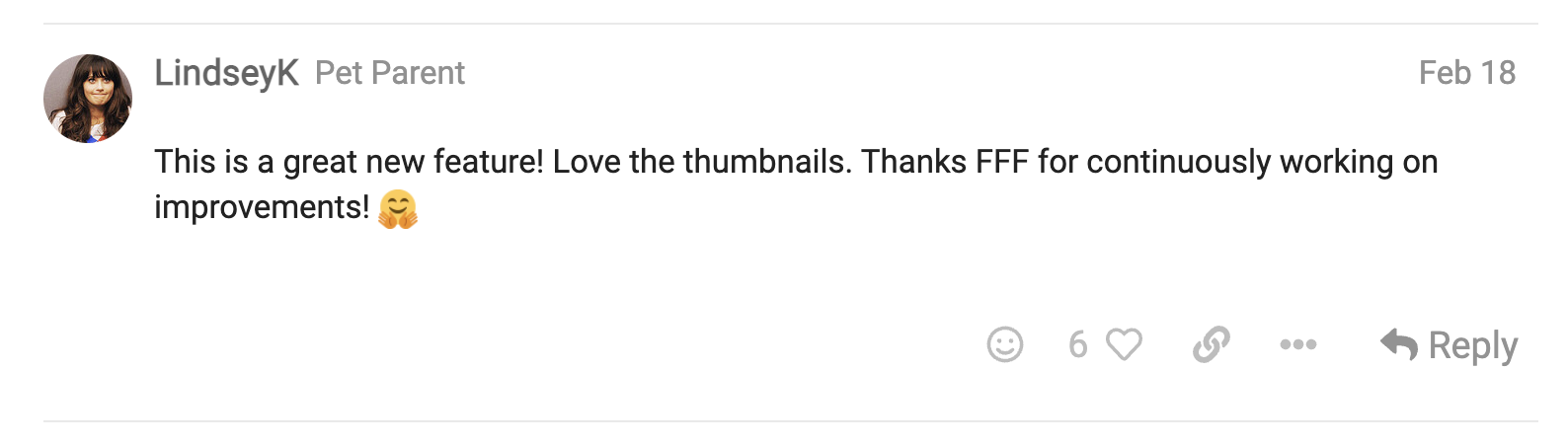
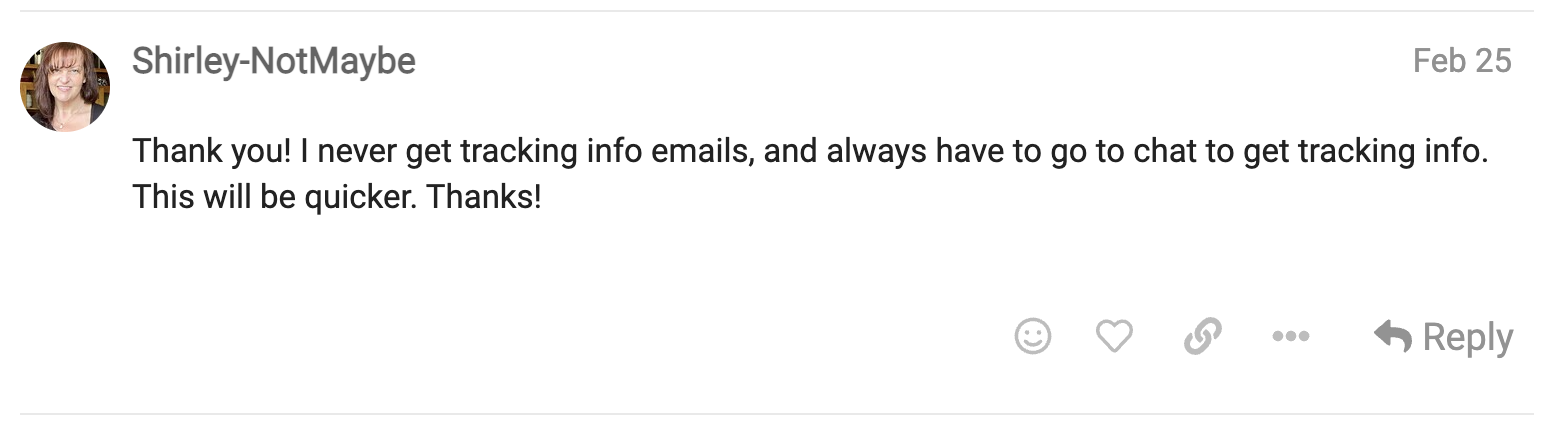
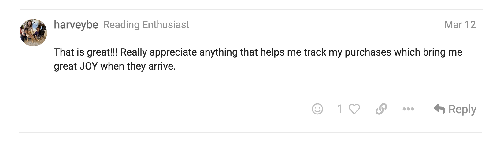
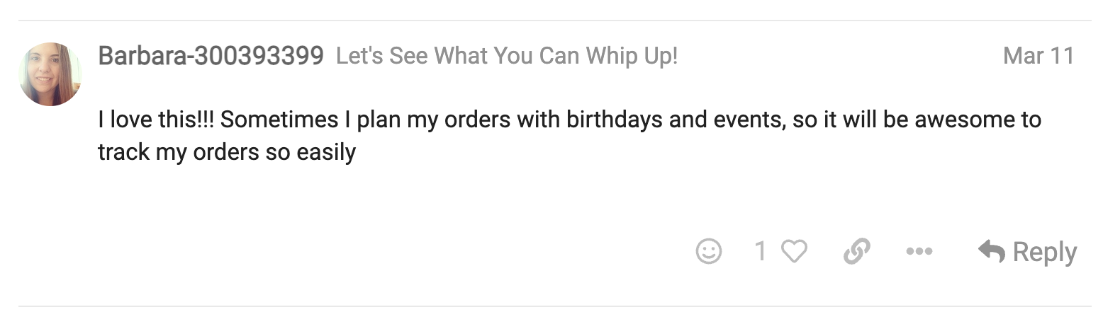
User Sentiment
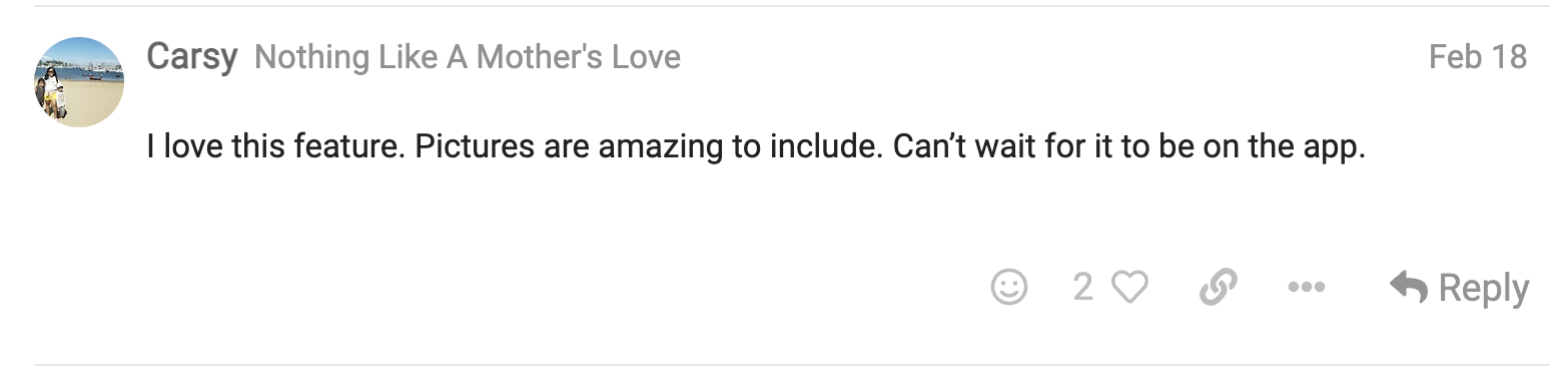
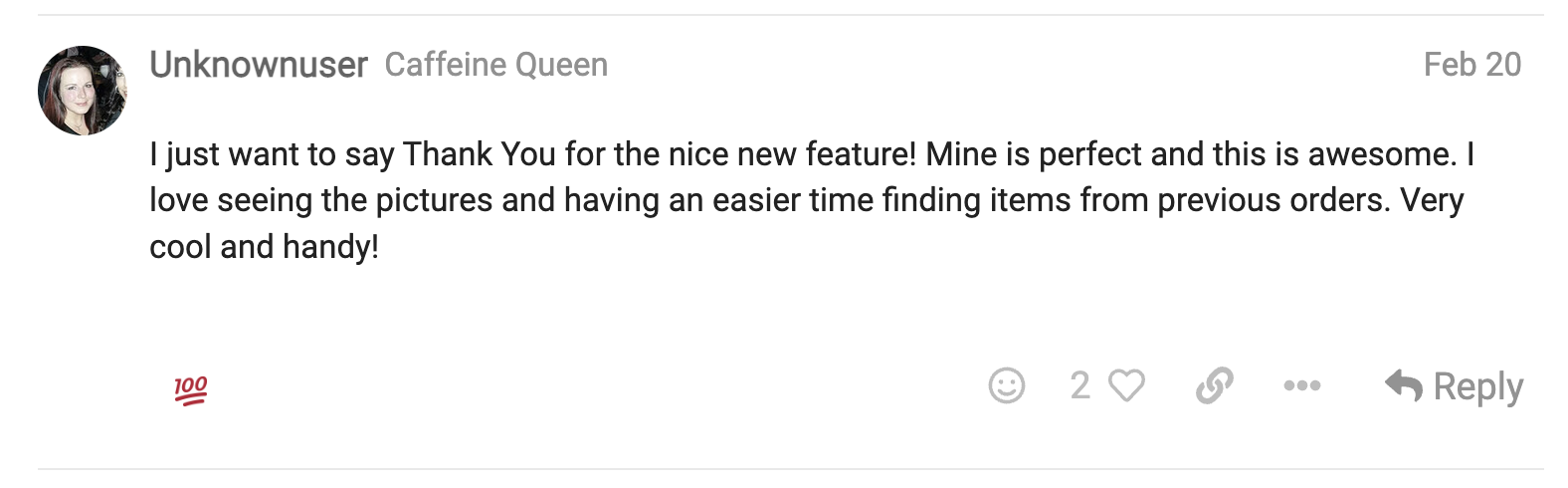
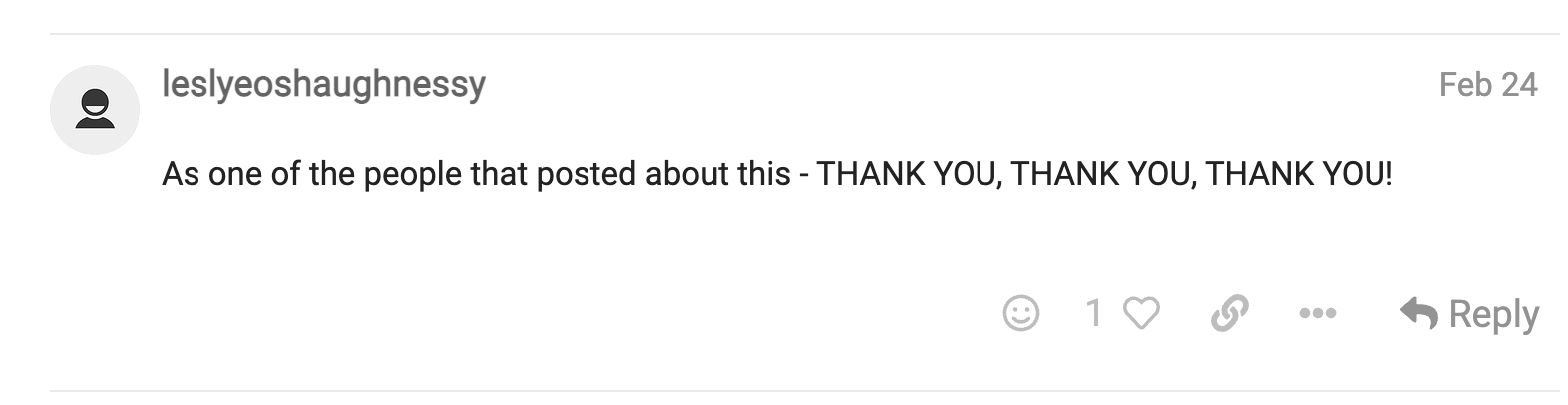
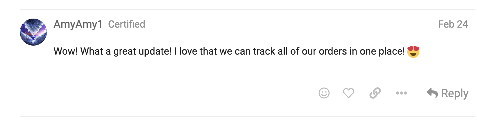
The Orders page went live on February 18, 2022, accompanied by a post announcing the feature in our Community forum. The reaction was positive with many expressing much excitement and appreciation.


Results
How Did It Perform?
The goals of launching the new Orders page were threefold. It was to provide the ability to track all orders, reduce CX tickets related to order status, and reduce shipping-related CX contacts. Over the first four months since its launch, it received the following performance metrics, demonstrating that it indeed accomplished all three goals.
272K+
Unique Visits
46.4%
Viewed an Order
37.6%
Tracked an Order
-53%
CX 'Order Status' Contacts
-79%
Negative Sentiment in CX Contacts
Reflection
Final Thoughts
The launched MVP was a great start to improving the ability of users to have a comprehensive overview of all their orders. However, because of the bandwidth and technical limitations of the engineering teams involved at the time, certain aspects of the feature were unable to make this first version. That included such details as the year and season of each purchase, linking invoices directly to their corresponding orders, and displaying orders before January 2022.
The team and I placed a higher priority to offer some improvement to the users while we iterated on future releases that would include the aforementioned missing features and more. Based on the results shown above, it seems the users would approve of our decision.