
work
Walmart Case Study
Optimizing user feedback with a scalable review template

Overview
This project aimed to redesign Walmart’s review template to optimize user feedback collection. The goal was to make the process more item-specific, encourage user engagement, and gather actionable data to enhance product reviews.
It started off as an initiative driven by the Apparel team, but was expanded to impact all verticals.
Role
Responsibilities
Collaborators
Timeline

The need for a redesign
In 2021, Walmart launched a unified website combining local pickup and delivery with e-commerce. Due to tight deadlines, the initial launch excluded some features, resulting in a simplified review form.
This version lacked dedicated fields for capturing item attributes, personal details, and order-specific information beyond the main review description.
Business Need
Walmart's current review template, being generic across all verticals, limits the collection of detailed user and item information.
User Need
Adding in ability to collect detailed feature data for a given item will provide increased informational value to customers leading to higher conversion rates and reduce possibility of return (e.g. because of wrong fit).
problem to solve
The existing review template is generic, missing item-specific questions and detailed data, which limits its value for both users and the business.
quick_reference_all
Research
Gathering information
1
content
What information is essential for users to provide in their reviews to be the most helpful to others?
2
organization
How can the form be structured to minimize burden and maximize the quality of data collected?
3
layout structure
What is the best way to design the review form to maximize user completion and submission?
Competitive analysis
Feature ratings
Companies included a varied number of feature ratings in their forms.
Target offers three optional feature ratings in addition to their required "sizing" question for an apparel item.
Amazon offers a comprehensive set of input options, including feature ratings and multiple-choice questions to assess varying levels of fit. Users have the flexibility to remove optional fields, as to make the form less overwhelming.
personal details asked
Questions included potentially sensitive information of varying degrees.
Shein asks potentially very sensitive information. Their form has inputs for bust, waist, hips, height, and weight measurements, but offers a points incentive if all inputs are filled out.
Glossier asks potentially trivial information. Their form has inputs for skin type, skin shade, but makes it clear these fields are optional.
presentation format
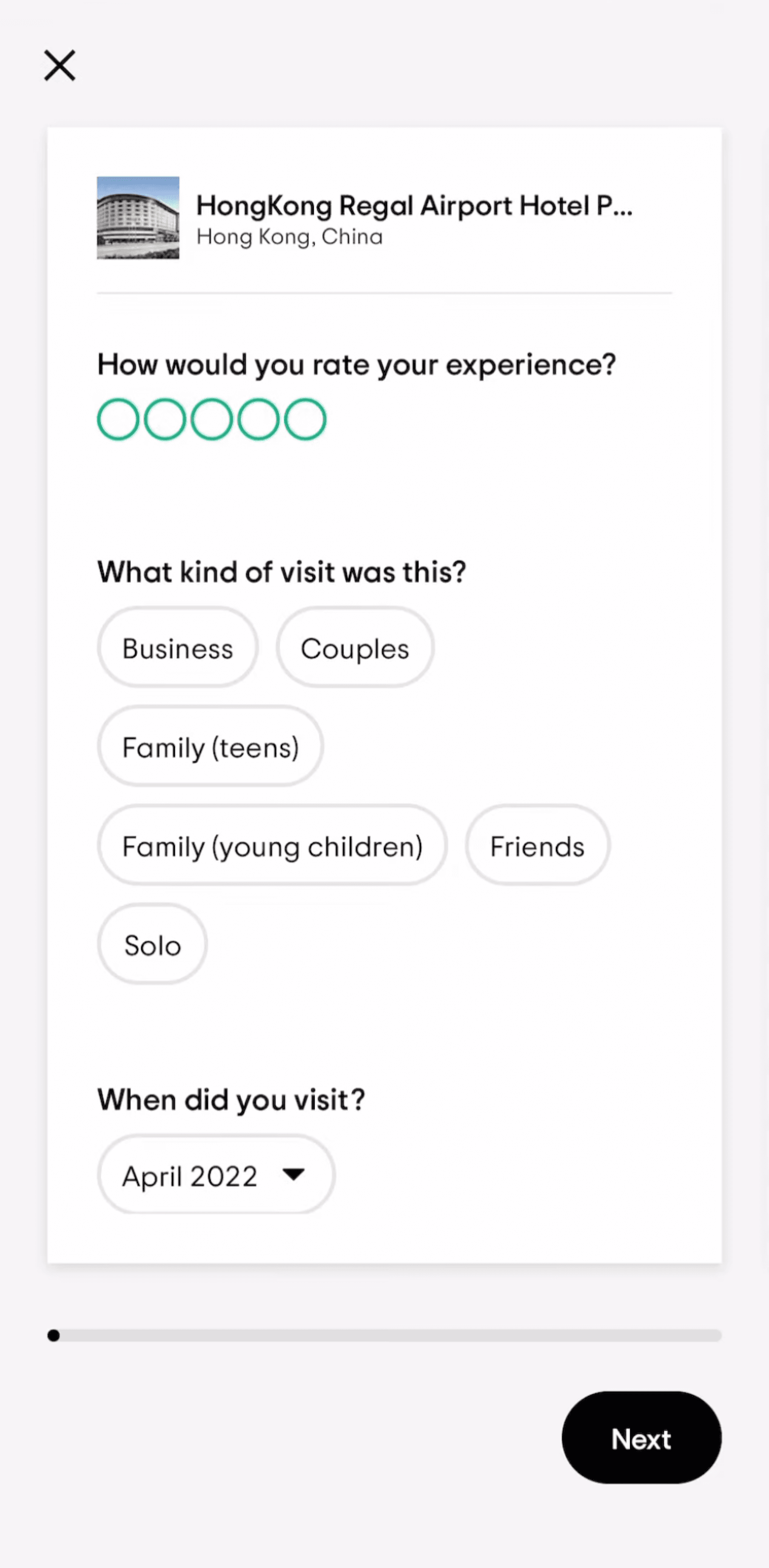
The formats included a single-page layout, a phased approach using an accordion, and a step-by-step wizard format.
Airbnb and Tripadvisor both utilize wizard flows (although Tripadvisor uses a different approach on desktop), asking a few questions at a time and showing a progress bar as the user goes through the steps.
J.Crew asks everything on one page, but in clean and spacious sections. The user can see all possible inputs to set expectations, but not feel overwhelmed by the length of the form.
DSW uses an accordion with five sections within a large modal. While they highlight that the last four sections are optional and keep them collapsed at the start, the implementation still feels a little overwhelming.
Target

Amazon

Shein

Glossier

Airbnb

Tripadvisor
j.crew

DSW

Answering the key questions
I identified solutions to my three key questions, which allowed me to define a clear opportunity to address both user and business challenges.
1
content
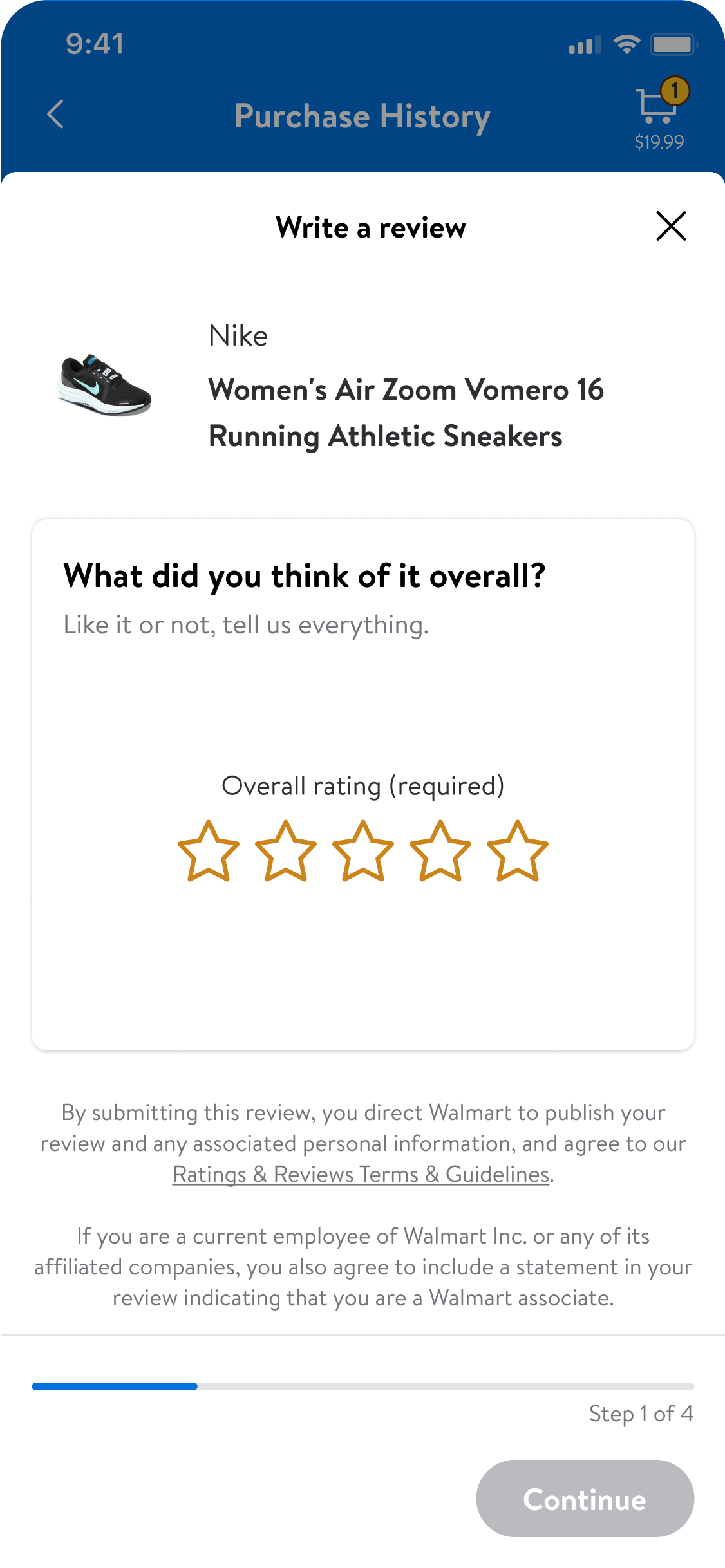
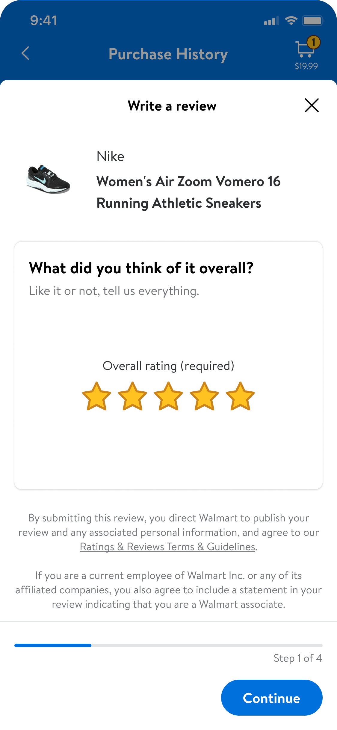
The most important inputs for users include: Overall rating, up to four feature ratings, review title, review description, photos, height, weight, age range, and item variant details.
2
organization
Group similar inputs into chunks to reduce cognitive load and improve intuitiveness. Prioritize critical questions early to capture key data before drop-off.
3
layout structure
Use a step-by-step approach with previews of upcoming steps to inform users and reduce uncertainty. Explore accordion and wizard layouts as design options.
How might we
Redesign the review template to collect detailed, item-specific feedback while improving user engagement and increasing completion rates?
lightbulb_2
Ideation
Developing concepts
This phase explores layout and structure options to improve the review form's usability and ensure an effective user experience.
Option 1: Accordion
Section 1
Rate
Section 2
Review
Section 3
Personal details
Option 2: Wizard
Section 1
Overall rating
Section 2
Images
Section 3
Feature ratings
Section 4
Review
Section 5
Personal details
Creating a review taxonomy
Based on my research, I prioritized key inputs and organized related questions to develop a taxonomy that organizes inputs effectively for different verticals.
The Accordion option offers a streamlined, scrollable experience, while the Wizard format breaks tasks into smaller, manageable steps for better user focus.
Establishing guiding principles
I developed guiding principles to ensure my solutions remained user-focused while balancing business goals and usability. They guided me as I explored multiple layouts and question structures to balance brevity and thoroughness.
These principles guided the development of two initial prototypes structured as:
A single-page format with collapsible sections for visibility into upcoming content (accordion)
A linear, step-by-step format for guided progression (wizard)
Accordion concept


Wizard concept


group
user testing
Testing my solutions
We conducted two rounds of unmoderated user testing with 38 participants. Each participant tested both prototypes, with the order randomized to avoid bias.


First round of user testing
The Wizard was perceived as less cluttered and less overwhelming; whereas, the Accordion was perceived as more flexible and faster to complete.
I iterated on the designs, incorporating key aspects of the Wizard into Accordion based on the insights learned:
Include a progress bar
Prioritize input fields users are more likely to complete
Second round of user testing
The results remained close but revealed clear evidence of order bias. My research partner and I analyzed the reasons behind participants’ preferences for each flow.
Key insights from this testing informed our final hybrid solution:
Add sticky bottom buttons for easier navigation
Prioritize simple response questions
Provide additional context when requesting sensitive information
Accordion

Wizard

editor_choice
Final Design
The optimized flow
After analyzing insights from user testing, I assessed the strengths of each flow, resolved pain points, and merged the two into a single optimized solution.
BEfore


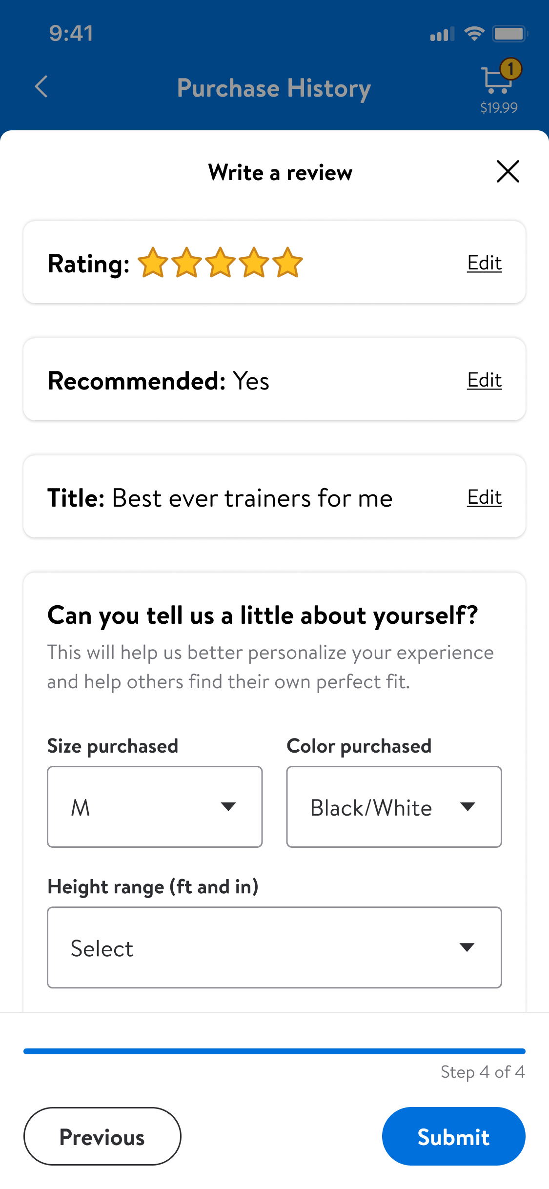
After
Ensuring transparency and ease of navigation
Different users prefer to complete varying portions of the form, choosing only the fields most relevant to them. The design offers control and flexibility with a progress bar for system status visibility and easy navigation through top accordions and dynamic buttons at the bottom.


An effortless first step
The form's only required input is presented upfront as a separate step, ensuring a smooth entry point and minimizing initial friction.
To prevent data loss if a user leaves before submitting the form, we ensure their overall rating is saved and explicitly inform them of this before they proceed to the next step.
Guiding Principle: Be delightful
Incorporate playful micro-animations of the stars populating to create a more delightful and enjoyable user experience.
why it matters
A positive and engaging initial experience is crucial for encouraging users to complete the entire form.


Scalable customization for all verticals
A key focus of this redesign was ensuring the form's scalability across all verticals. For Apparel, this meant using four fixed ratings and a custom input, while other verticals feature customizable options to highlight the most relevant attributes.
guiding principle: be vertical specific
Design feature ratings to be customizable for any vertical while maintaining a clear and intuitive component structure.
why it matters
Reviewers need an easy way to provide detailed, category-specific feedback, ensuring relevance and helping others make confident, informed decisions.
Different users prefer writing varying levels of detail in their reviews. Making all the fields optional lets them provide exactly the amount of information that feels 'just right' for them.
why it matters
Giving users the option to skip the page or fill out only what they want reduces drop-off and encourages review completion.


Improving fit decisions with personal details
Apparel users often struggle with online sizing decisions since they can’t try on items. Reviews with personal details, such as height and weight, provide valuable reference points, helping users make more confident and informed fit decisions.
Saving this information lays the foundation for an apparel profile, enabling personalized fit recommendations in the future.
guiding principle: be vertical specific
Apparel users require more personalized and detailed reviews than other verticals to make confident purchase decisions.
why it matters
Fit uncertainty increases returns and lowers customer satisfaction. Providing relatable reference points to determine correct fit helps build trust, boost confidence, and encourage repeat purchases.


monitoring
impact
The results
This project successfully transformed Walmart's review form template, making it more scalable, user-friendly, and effective in gathering actionable feedback to drive user engagement and business insights.
What I learned from this project
handshake
Navigating the differing priorities of the Apparel and UGC teams and finding a design solution that met both their needs was a rewarding challenge, fostering collaboration and delivering impactful results.
reviews
This project highlighted the importance of designing reviews with depth and relevance to foster trust, enhance user experiences, and enable better decision-making for both users and the business.
published_with_changes
Challenging my assumptions about user preferences uncovered surprising insights that reshaped the design solution and reinforced the value of adaptability and iteration.
trending_up
Launching an MVP showed the power of simplicity and iteration. Later enhancements, like AI-powered topic suggestions and voice input, proved the long-term value of iterative design.
work
Next Case Study

